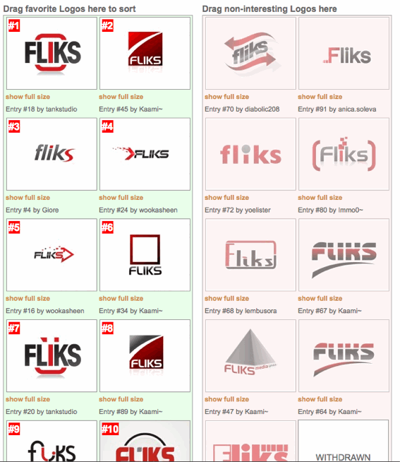
 As our old company logo (as seen on the left) needed a redesign we just started a competition on logotournament.com where we got 91 Entries until today. While we don’t like all of them, we were pleasantly surprised by many of the others and would like to hear your feedback and suggestions on them.
Copy of our brief:
Company Name:FliksSlogan:What We Do:We are an internet company creating, operating and marketing own, mostly community-based, web projects.Our Industry:InternetFormats Accepted.EPS onlyTop Three Things to Communicate through our Logo:#1 – Passion for internet projects
#2 – Internal unity
#3 – We’re skilled and always strive for the technological leadOur Target Audience:Internet experts looking for the guys running this cool site/service.Styles that we are interested in:Wordmark
A wordmark consists of the company name in a stylized type and may include small asbstract or pictorial elements. Famous examples include:
Pictoral Mark
A pictorial mark uses literal or representative imagery to symbolize the brand. Famous examples include:
Please note that the above brands are in no way, shape, or form associated with LogoTournament. They are cited as examples under Fair Use for the enrichment of the general public’s knowledge of the graphic arts.
Color Preferences:Our company color is a bright red (RAL 3020, CMYK 0, 100, 100, 10) which should at least appear in the logo. Contrasting colours could be white, grey and/or black tones.Our Ideas and Additional Information:Our Ideas and additional information: Fliks has two divisions: “Fliks GmbH” in Germany, “GmbH meaning the kind of legal entity of our company in Germany. In South Africa, its “Fliks Media (Pty) Ltd.” Fliks is a company that has very few customers and whose projects do mostly have their own branding/logo. Therefore, the fliks logo represents our company itself alone. The logo will appear on the web mostly on contact information pages, offline on businesscards and letters. Therefore it should be readable in small sizes, too. “Fliks” is a made up word resembling the german words “flink” or “fix”, wich associates to “quick”, “alert”, “fast”. Therefore the logo should represent a dynamic, fast acting, leading company in a rapidly developing IT/mediabased business field, competence as well als open-mindedness. Internally, it also should stand for our unity/community/alliance. Our core competences are SEO, Community Management, Web2.0, PHP/MySQL. We’re hosting optimized, high traffic websites like the redirector service anonym.to as well as specialist (news)sites like the german mac magazine macnotes.de. As recognized by the company names, we also operate international the non-virtual way in germany as well as in south africa. Finally, we’re in the internet business for more than 10 years now, therefore we don’t want to be associated with new startups from the web2.0-boom. Ideas and recent logos: We always used “brackets” or symbols reminding brackets in our recent logos, symbolizing internal unity. Recent logo: visible on http://www.fliks.com Very old logo: http://www.flickr.com/photos/21075605@N00/3561930285/


[…] Kopie des Briefings auf meinem englischen Blog […]
#78 u #61 sind meine favoriten…..